UX Process
UX design lifecycle
User Experience (UX) design is a collaborative process to optimise software, applications or websites. The UX designer draws on understanding of user behaviour, market research, business requirements and technical capabilities / restrictions, and then leads designers to create the best possible interface.
Research
Concept
Wireframe
Design
Build
Launch
UX design is a process, not an outcome. I bring 30 years of experience, but each time I undertake a UX project I begin with the theory that I know nothing about the product, market, users or business. This ensures I don't bring preconceptions or false assumptions.
As I learn about the project, uncertainty transforms into clarity. Design stages blend into one another as the product design moves into conceptualisation, wireframes, high-resolution design and eventually production and launch.
Throughout the process I'll meet with stakeholders to gather information and present findings, ensuring buy-in from all the key players. And at each stage assumptions are tested, often using focus groups or by observing real users.
Research
The first step is always research-based: I'll take time to understand the challenges and opportunities, assess competitors, and familiarise myself with the market.
Meet stakeholders
+ Customers
+ Internal users
Understand market
Assess competitors
SWAT analysis
Brainstorm features
Prioritise!
Group by value
Document outcomes
Confirm with
stakeholders
I will meet with key stakeholders - often in multiple sessions - and use post-it notes to:
- Define users. Create a rough (not final) list of user types, for example: a new user, a returning user, a registered member, a user with a specific requirement, etc.
- Brainstorm. At this stage no ideas are ruled in or out; this is simply an ideas-gathering exercise. Each idea is added to a post-it note and stuck on a wall.
- Evaluate. Ideas are evaluated for feasibility and desirability. "Bad" ideas are not thrown away, simply de-prioritised.
- Group. Ideas are grouped using multiple criteria:
- User (i.e. what type of user does this idea satisfy)
- Achievability (i.e. idea 1 is quick and simple)
- ROI (i.e. idea 2 might be harder to do, but brings a greater return on investment)
- Dependencies (i.e. idea 1 cannot be done until we have completed idea 2)
- MVP. Prioritise the ideas from the previous sessions which can deliver the Minimum Viable Product. It is always better to get to market fast and capture users, members, loyalty and brand recognition.
User journeys and wireframes
At this stage I will create user-profiles and journeys, and from them (and previous research) develop wireframes.
Depending on the requirements of the project, wireframes might be developed in a rapid prototyping tool (such as Adobe XD), or as HTML pages to demonstrate responsiveness, interactivity and a suggestion of visual design standards.
Prototypes
Because I am also a front-end developer, designer and coder, I can - as required - develop front-end prototypes. I believe these help to deliver more useful user-feedback than wireframes, since they give users and testers a better appreciation of the finished product.
Here are some examples.
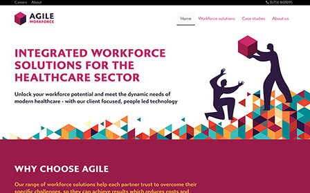
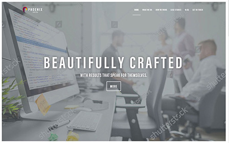
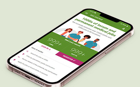
You can see many more examples of my design prototypes on my portfolio.
Design
We now enter the design phase - converting wireframes and research findings into high-quality, consistent and appealing front-end designs. In addition to being a UX designer, I am also a UI (User Interface) designer and team leader, and can be hands-on at this stage, or manage a team of designers to deliver the optimal result.
This process includes working with technical staff, to ensure coding standards are met, and that the interface being developed does not present technical challenges.
It's also important to work with copywriters (although as a published author I am a very experienced writer, and am happy to undertake copywriting where it is appropriate).
Build
Just because design is completed, it doesn't mean the UX designer's role is over.
I am involved throughout the build process, testing and approving implementation, solving problems as they arise, and continuing to test my research and assumptions.
It is important not to become complacent, and assume the work is over: technical problems and misintepretations of the research must be resolved. But beyond that, it is possible the real-world implementation of designs fails to produce the results expected. A good UX designer must always be prepared to change their minds if data and research show there is a better solution.
Launch ... and beyond.
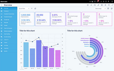
Once the site or application is launched, its vital to continue to test its performance. This is done via tools such as Google Analytics, Hotjar and other user-testing agents.
It is not always possible to make accurate predictions about performance, but if they can made, they should be. And real-world data will tell you if the project is meeting expectations.
Continuous measurement should be made, and improvement sought.
Case study
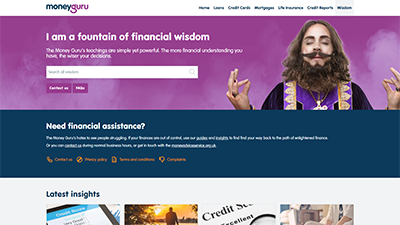
MoneyGuru
MoneyGuru is a consumer loan, credit card and financial services comparison website. I was employed as Lead Designer, a role which encompassed UX, UI and brand design for MoneyGuru and 12 other sites owned by the parent company, The Quint Group.
When I joined the business MoneyGuru delivered approximately £500 million of price comparisons per month, but there was a strong opportunity for growth, and to convert more users into customers.
Key issues
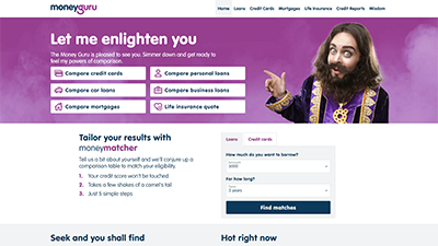
Confusing terminology
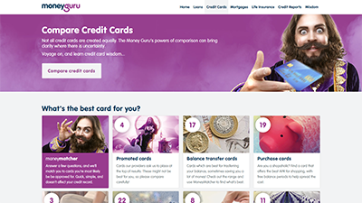
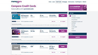
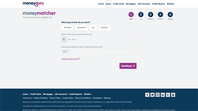
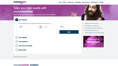
The main price comparison tool was called "MoneyMatcher", which didn't immediately tell users what it was for. It was obvious that clearer labelling throughout the site was necessary.
Solution
The solution was data-led: I resolved the problems with terminology by A/B testing multiple alternatives on the live website, and then implemented these changes immediately.
Bad UI on mobile devices
The MoneyGuru brand had originally been developed by an advertising agency, who only provided designs for desktop. Developers - not designers - had then attempted to make these responsive, but the UI and UX were poor.
Solution
Use website analytics to demonstrate to the board that over 80% of their traffic was on mobile, and - due to the demographics of people seeking short-term loans - many of these used older, smaller phones and (at the time) lived in areas which still had a heavy use of 3G. This data justified an immediate redesign of the mobile experience.
I developed multiple mobile UI variations, user-tested them with focus groups and stakeholders, provided speed-tests to ensure performance improvements, and then developed and A/B tested the most popular 2 variations until a clear "winner" was apparent.
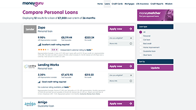
Over-complicated navigation
The site was over-reliant on the main navigation bar (and hamburger menu on mobile devices), rather than having major tools and clear calls-to-action within the body of the homepage content. And to reach significant features of the site, users often had to click two or even three links.
Solution
I led internal meetings and worked with data analysis to identify the key product features. The most important was place as a functioning tool in the top of the homepage. Other features became prominent call-to-action buttons that would be visible without scrolling. The rest of the site navigation was optimised into fewer, clearer links, with revised terminology.
I took precautions to include link-forwarding, so when pages and sections of the site were given new names, links and bookmarks to their old names would automatically forward to the new URL.
Slow rendering
The website had been built using a combination of three different HTML frameworks (Bootstrap, Foundation and proprietary code) plus over 25 JavaScript files on the homepage alone. This meant the code was much too large, very inefficient, and downloaded and rendered very slowly.
Solution
I developed my own front-end framework, Liteframe, which was only 51k, compared with over 700k of CSS being used by the website. I also designed a proprietary SVG icon library, Quindicate, so the site would no longer have to rely on loading icons from 7 different sources.
I proposed delivering the site using the AMP framework, and developed versions of the front-end for AMP as a proof-of-concept. However it was decided the improvements to site speed were successful without shifting to AMP.
Difficult forms
The application for a loan can be time-consuming, and making changes to the forms on the live site was a slow manual process, which didn't favour rapid A/B testing.
Solution
I developed an (unbranded) form library, which allowed the colours, styling and form structure to be changed using a config file. Working with the lead developer, this was extended to become a fully functional form engine, which allowed the UX team to quickly add, remove or configure each form field, and to A/B test the entire form interface in seconds, by simple editing a config file.
The form engine could also be used on the plethora of microsites that targeted discrete markets (such as MyFinance) which used the MoneyGuru engine to provide loans.
This process led to a 28% increase in the number of users completing the forms and being approved for a loan or credit card.
Slow comparison
The "decision engine" - the code which performed comparisons and suggested products to users - often took over a minute to return results, during which time the website provided little indication to users of what was happening.
Solution
I used statistical data to demonstrate to the Board that this combination of slow front-end rendering and slow comparison was having a material impact on conversion rates. For example, data from Google suggested 53% of users would abandon the site if it took longer than 7 seconds to render (Download performance improvement research [.pptx file]).
This research led to the formation of an internal software team to re-write the business's core comparison engine, which reduced the time taken to perform a comparison from over 1 minute to under 20 seconds.
I also added user-feedback to the website, which informed users of the progress of their comparison. While this process was happening the site would display an animation to keep attention.
These changes helped to improve conversion rates by 46%.
Data, links and designs mentioned in this case study: